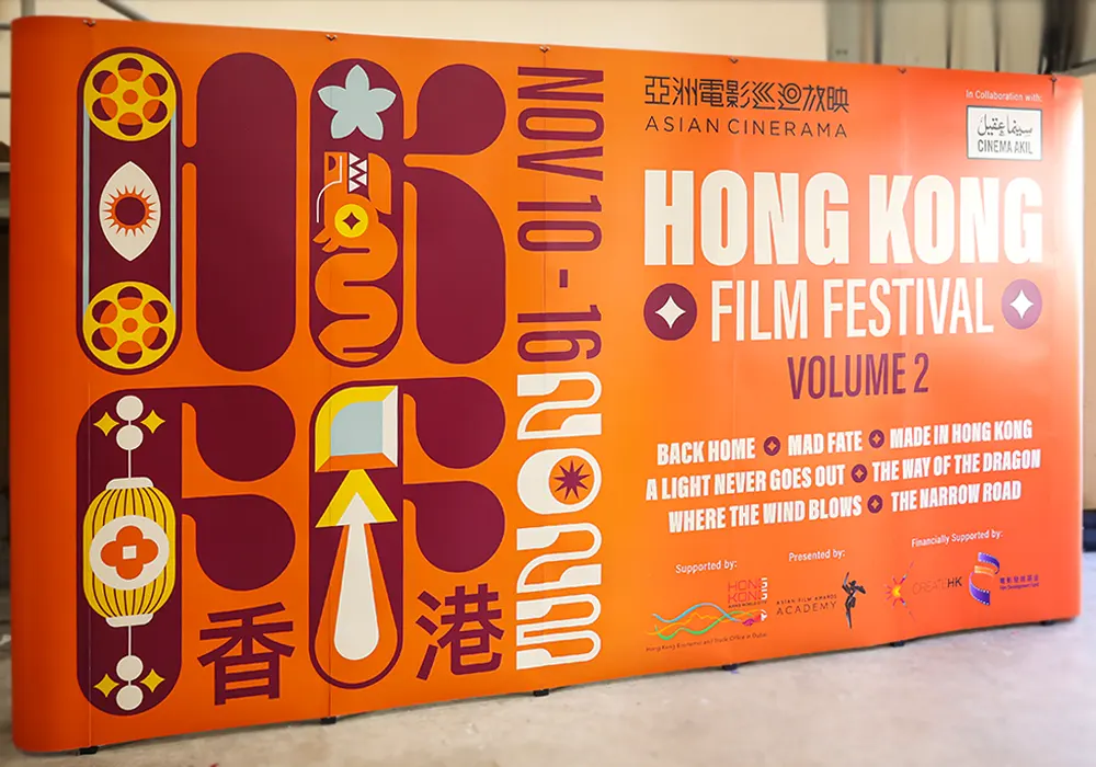
Business banners are a powerful tool for grabbing attention, communicating your brand message, and driving action—whether online or offline. However, poorly designed banners can easily go unnoticed or, worse, leave a negative impression on potential customers. To ensure your banner stands out for the right reasons, let’s explore some common mistakes businesses make when designing banners and how you can avoid them.
1. Cluttered Visuals
The Mistake: One of the biggest mistakes in banner design is including too many elements—images, text, logos, graphics—which leads to a cluttered and overwhelming visual. A busy design can confuse viewers and dilute your core message.
The Solution: Aim for simplicity. Focus on one central message and use negative space effectively to keep the banner clean and easy to absorb. Highlight only the key information that you want the viewer to retain, and make sure the visual hierarchy directs attention where it matters most.
2. Hard-to-Read Text
The Mistake: Using fonts that are too small, overly decorative, or poorly contrasted with the background can make text difficult to read. The purpose of a banner is to communicate quickly, and unreadable text defeats this purpose.
The Solution: Stick to large, bold fonts that can be easily read from a distance. Choose contrasting colors for text and background to enhance readability. A simple, sans-serif font often works best for banners that are meant to be viewed in a flash.
3. Lack of Clear Call-to-Action (CTA)
The Mistake: Some banners fail to include a clear call-to-action, leaving the audience unsure of what to do next. A banner without a CTA misses the opportunity to prompt a specific action, which is crucial for driving results.
The Solution: Always include a well-defined CTA that tells viewers what to do next—whether it’s “Visit Our Website,” “Call Now,” or “Shop Today.” Make the CTA stand out by using a contrasting color or a button-like design, and place it in a prominent position on the banner.
4. Poor Image Quality
The Mistake: Using low-resolution or pixelated images can make your banner look unprofessional and unappealing. Images that appear blurry or stretched reflect poorly on your brand.
The Solution: Use high-quality images that are optimized for the size of your banner. If you’re unsure, choose vector graphics that can be scaled without losing quality. High-quality visuals help build trust and create a polished, professional look.
5. Ignoring Branding Consistency
The Mistake: Failing to align the banner design with your brand identity can create confusion among viewers. Inconsistent colors, logos, and messaging may make it difficult for people to connect the banner to your business.
The Solution: Ensure your banner reflects your brand’s colors, fonts, and logo consistently. Branding consistency helps build brand recognition and ensures your message resonates with your target audience.
6. Too Much Text
The Mistake: Packing too much information into a banner can overwhelm viewers and deter them from engaging with the content. A banner is meant to capture attention quickly, not to provide a full article.
The Solution: Use concise language. Focus on one main message and a few supporting words. Less is more when it comes to effective banner design. Keep the text brief, impactful, and to the point to ensure it’s easily digestible.
7. Ignoring the Target Audience
The Mistake: Designing a banner without considering who the target audience is can lead to ineffective messaging. A generic banner may not resonate with your intended viewers.
The Solution: Understand your audience before designing the banner. Tailor the message, imagery, and overall design to appeal specifically to your target group. For example, a banner targeting young professionals may use a modern, sleek design, while one aimed at families might use a friendly, warm tone.
8. Poor Placement Considerations
The Mistake: Designing a banner without considering where it will be displayed—be it online, on a roadside billboard, or at a tradeshow—can lead to poor results. A banner that works great online may not translate well to a large format print.
The Solution: Think about where your banner will be displayed and design accordingly. For roadside banners, make sure the text is large enough to be read quickly from a distance. For digital banners, consider the placement on a webpage and the potential need for clickable elements.
Conclusion
Designing an effective business banner involves more than just aesthetics—it’s about clarity, simplicity, and aligning with your business goals. By avoiding these common mistakes and keeping your audience in mind, you can create a banner that captures attention, communicates effectively, and drives action. Whether it’s for an event, promotion, or branding purpose, a well-designed banner can make a significant impact.
Remember, a banner is often the first impression people have of your business. Make it count by avoiding clutter, focusing on clarity, and ensuring a cohesive and professional look.


