In today’s fast-paced business world, making a memorable first impression is crucial. One often underestimated yet highly effective way to achieve this is through strategic signage placement in your office space. Signage serves not only as a means of providing information but also as a powerful branding tool. In this article, we will explore the art of signage placement and how it can maximize impact in your office environment.
Signage as a Branding Asset
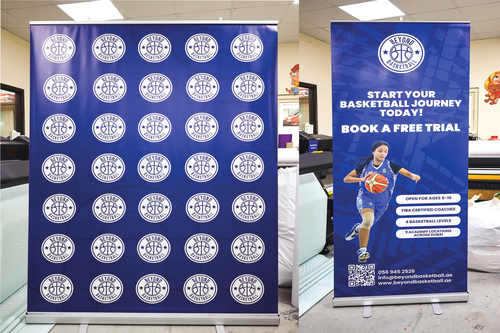
Before delving into the specifics of placement, it’s essential to understand the role signage plays in branding. Signage is not merely a wayfinding tool; it’s an integral part of your brand identity. When designed and placed strategically, signage reinforces your brand message and leaves a lasting impression on clients, employees, and visitors.
Reception Area: The First Impression
The reception area is often the first point of contact for clients and visitors. This is where the art of signage placement begins. Your company logo should be prominently displayed here, ideally as a focal point behind the reception desk. Using well-lit, three-dimensional signage can create a striking visual impact, leaving a memorable first impression.
Wayfinding Signage: Navigating with Ease
Efficient wayfinding signage is crucial for any office space, especially if it’s sprawling or has multiple floors. Consider using bold, easy-to-read fonts and clear directional arrows to guide people effortlessly. Wayfinding signs should be strategically placed at key intersections, elevators, and stairwells to prevent confusion and enhance the overall experience of your office space.
Office Door Signage: Personalized and Professional
For individual offices, personalized door signage adds a touch of professionalism while also helping with identification. Using consistent design elements such as fonts and colors in all office door signs reinforces your brand’s visual identity. Ensure that these signs are well-lit and easily visible from the hallway.
Meeting Rooms: Create a Lasting Impression
Meeting rooms are where important discussions take place. Using signage to name these spaces not only adds a professional touch but also creates a lasting impression. Opt for signage that complements the room’s purpose and ambiance. For instance, a creative brainstorming room could have playful signage, while the boardroom could feature more formal designs.
Common Areas: Reinforce Your Culture
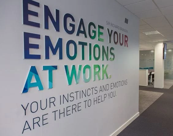
In common areas such as break rooms, kitchens, and lounges, signage can be used creatively to reinforce your company culture and values. Inspirational quotes, company mission statements, or even employee achievements can be displayed through visually appealing signage. This not only motivates employees but also communicates your brand’s ethos to visitors.
Hallways and Corridors: Seamless Branding
Hallways and corridors are often overlooked spaces where signage can make a significant impact. Consider using these areas to showcase the history, milestones, or achievements of your company. This not only enhances the visual appeal of these spaces but also tells a story about your brand’s journey.
Illuminated Signage: Stand Out After Hours
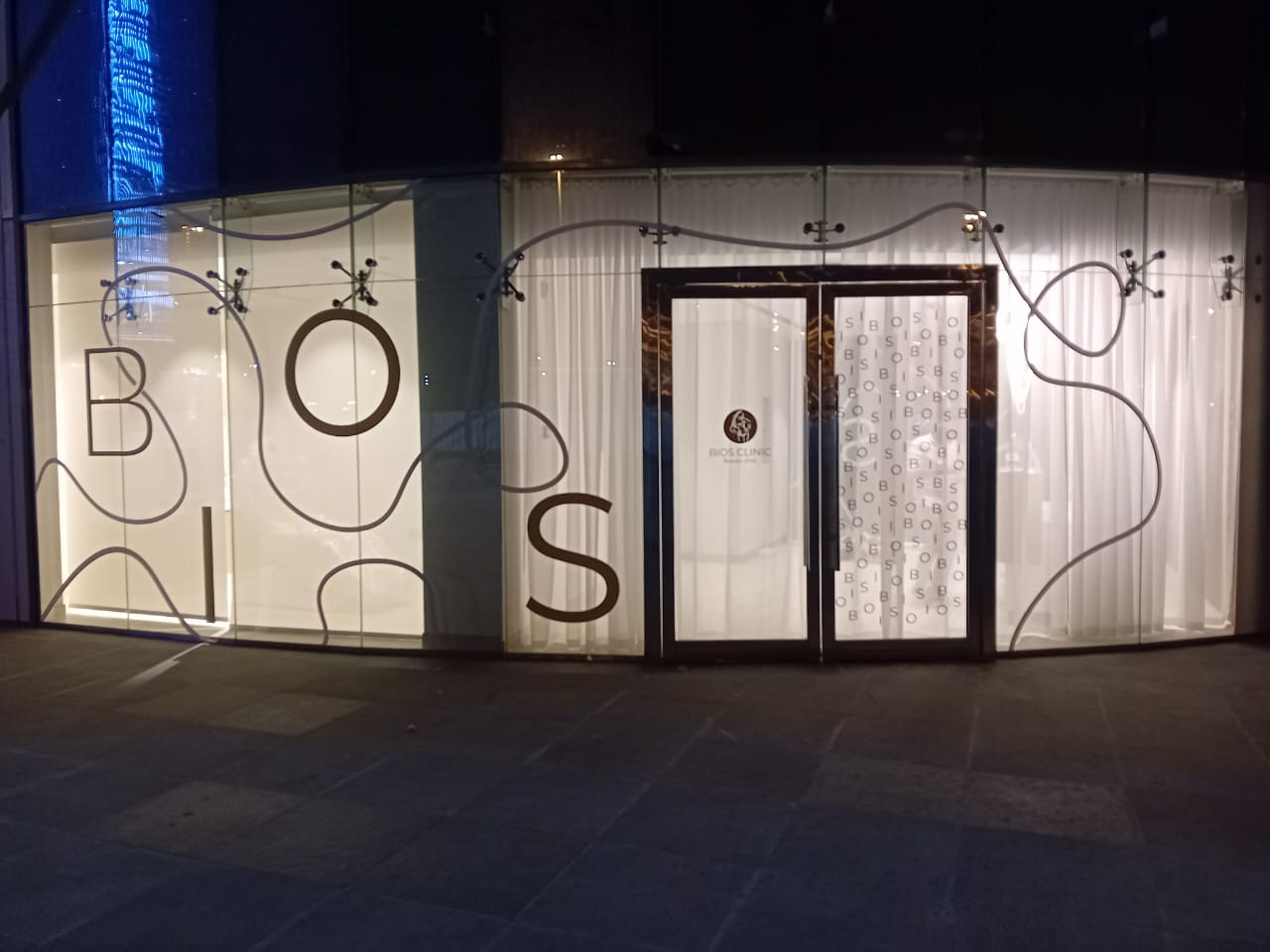
In some office environments, especially those in busy commercial districts, your office might be open well into the evening. Illuminated signage can be a game-changer here. Lit signs not only ensure visibility but also make your office stand out in the evening, making it easy for clients and visitors to find you even after dark.
ADA-Compliant Signage: Accessibility Matters
When placing signage in your office, it’s crucial to ensure compliance with the Americans with Disabilities Act (ADA). ADA-compliant signage makes your space accessible to all individuals, regardless of their physical abilities. Properly designed and placed ADA signage demonstrates your commitment to inclusivity and diversity.
Maintenance and Updates: Keeping it Fresh
Once you’ve strategically placed your signage, don’t forget about maintenance and updates. Signs should be regularly inspected to ensure they remain in good condition. Any wear and tear should be promptly addressed. Additionally, as your brand evolves, consider updating signage to reflect new branding elements or messaging.
Conclusion
In conclusion, the art of signage placement in your office is not just about aesthetics; it’s about creating a lasting and positive impression on everyone who walks through your doors. When done strategically, signage becomes a powerful branding asset, reinforcing your company’s identity and values. From the reception area to the hallways and common spaces, every corner of your office can benefit from well-placed and thoughtfully designed signage.
Investing in high-quality signage and paying attention to its placement is a worthwhile endeavor that can set your business apart. By maximizing the impact of signage in your office, you create an environment that not only impresses clients and visitors but also motivates and inspires your employees. So, take the time to evaluate your office’s signage strategy and make the necessary adjustments to ensure that it truly reflects the essence of your brand.


